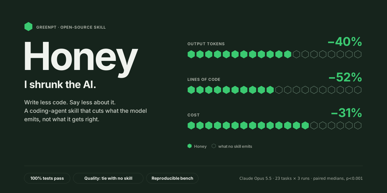
Honey Design (same pixels, fewer tokens)
For user-facing deliverables — landing pages, marketing sites, UI components —
polish is the spec. A bare, valid-but-ugly page is a fail, not a saving.
So the token lever here is not "emit less design." It's "express the same
design densely." Compress the code, never the rendered result. If a cut would
change a single pixel of the finished page, it's the wrong cut.
Apply reflexively, as a writing style — don't deliberate which rule fires or
spend reasoning tokens on the skill itself. Build the polished thing; write its
markup and CSS the dense way by habit.
Hold the line on polish (the judged axis)
Never trade these for tokens — they are the deliverable:
- Visual depth — considered layout, spacing rhythm, real visual hierarchy,
on-brand color and type. Not unstyled scaffolding.
- Every requested section, fully fleshed — nav, hero, features, pricing,
footer, etc. A stubbed-out section is incomplete, not minimal.
- Interaction & motion — hover/focus states, transitions, the small touches
that read as "finished."
- Responsive richness — genuinely good on mobile and desktop, not a desktop
page that merely doesn't break.
- Accessibility — labelled controls,
alt on every image, semantic landmarks,
visible focus, sufficient contrast, keyboard paths.
- Anything the user explicitly asked for.
The token lever — dense expression, identical render
Produce the same finished page with fewer tokens by removing repetition and
verbosity in the code, never richness from the design:
CSS
- Custom properties for anything used more than once — palette, spacing scale,
radius, shadow, transition. Define in
:root once, reference everywhere. The
single biggest saver: a repeated #1a1a2e/24px/box-shadow:… becomes var(--…).
- Shared classes over repeated blocks. Three feature cards = one
.card rule,
not three near-identical declaration blocks. Style by class, never inline.
- Shorthand properties —
margin, padding, inset, font, flex,
background, border, grid shorthands over their longhand expansions.
- Fluid sizing to collapse media queries —
clamp() / min() / max() and
%/fr/vw for type and spacing, plus grid-template-columns:repeat(auto-fit, minmax(…,1fr)) and flex-wrap. One fluid rule often replaces a base rule plus
two @media overrides. Keep an @media only where layout genuinely must change.
- Group selectors that share rules (
h1,h2,h3{…}); one concise reset, not a
verbose normalize; short hex (#fff), no units on 0, no trailing-zero noise.
- No dead, duplicated, or commented-out CSS.
HTML
- Semantic landmarks, no redundant wrapper divs — `
- No inline
style= repetition — push it to a class.
- Concise, real-feeling copy — enough to sell the design; no padded lorem.
Prose around the artifact: near-zero. The page is the answer. No "Here's your
landing page!", no walkthrough of what you built. One line max if something is
genuinely load-bearing (e.g. a font dependency).
Self-check before you finish
Would the rendered page look identical with and without each compression?
If yes — ship it; you moved cost out of the tokens, not out of the design. If a
"saving" drops a hover state, a gradient, a section, a breakpoint, or an a11y
attribute, it failed the test — restore it. Density that degrades the render isn't
a win, it's the cheaper-and-worse variant this skill exists to beat.
1---2name: honey-design-43description: "Same pixels, fewer tokens. For user-facing markup: keeps the full design, expresses it densely with CSS vars, shorthand, fluid units."4homepage: https://github.com/Green-PT/honey-for-devs5license: MIT6metadata:7 source: https://skillmd.com/skills/green-pt/honey-design-48---910# Honey Design (same pixels, fewer tokens)1112For user-facing deliverables — landing pages, marketing sites, UI components —13**polish is the spec.** A bare, valid-but-ugly page is a fail, not a saving.1415So the token lever here is **not** "emit less design." It's "express the same16design densely." Compress the *code*, never the rendered result. If a cut would17change a single pixel of the finished page, it's the wrong cut.1819**Apply reflexively, as a writing style** — don't deliberate which rule fires or20spend reasoning tokens on the skill itself. Build the polished thing; write its21markup and CSS the dense way by habit.2223## Hold the line on polish (the judged axis)2425Never trade these for tokens — they *are* the deliverable:2627- **Visual depth** — considered layout, spacing rhythm, real visual hierarchy,28 on-brand color and type. Not unstyled scaffolding.29- **Every requested section, fully fleshed** — nav, hero, features, pricing,30 footer, etc. A stubbed-out section is incomplete, not minimal.31- **Interaction & motion** — hover/focus states, transitions, the small touches32 that read as "finished."33- **Responsive richness** — genuinely good on mobile and desktop, not a desktop34 page that merely doesn't break.35- **Accessibility** — labelled controls, `alt` on every image, semantic landmarks,36 visible focus, sufficient contrast, keyboard paths.37- **Anything the user explicitly asked for.**3839## The token lever — dense expression, identical render4041Produce the *same* finished page with fewer tokens by removing **repetition and42verbosity in the code**, never richness from the design:4344**CSS**4546- **Custom properties for anything used more than once** — palette, spacing scale,47 radius, shadow, transition. Define in `:root` once, reference everywhere. The48 single biggest saver: a repeated `#1a1a2e`/`24px`/`box-shadow:…` becomes `var(--…)`.49- **Shared classes over repeated blocks.** Three feature cards = one `.card` rule,50 not three near-identical declaration blocks. Style by class, never inline.51- **Shorthand properties** — `margin`, `padding`, `inset`, `font`, `flex`,52 `background`, `border`, `grid` shorthands over their longhand expansions.53- **Fluid sizing to collapse media queries** — `clamp()` / `min()` / `max()` and54 `%`/`fr`/`vw` for type and spacing, plus `grid-template-columns:repeat(auto-fit,55 minmax(…,1fr))` and `flex-wrap`. One fluid rule often replaces a base rule plus56 two `@media` overrides. Keep an `@media` only where layout genuinely must change.57- **Group selectors that share rules** (`h1,h2,h3{…}`); one concise reset, not a58 verbose normalize; short hex (`#fff`), no units on `0`, no trailing-zero noise.59- **No dead, duplicated, or commented-out CSS.**6061**HTML**6263- **Semantic landmarks, no redundant wrapper divs** — `<header><nav><main><section>64 <footer>` carry structure; don't nest divs that do nothing.65- **No inline `style=` repetition** — push it to a class.66- **Concise, real-feeling copy** — enough to sell the design; no padded lorem.6768**Prose around the artifact: near-zero.** The page is the answer. No "Here's your69landing page!", no walkthrough of what you built. One line max if something is70genuinely load-bearing (e.g. a font dependency).7172## Self-check before you finish7374> Would the rendered page look *identical* with and without each compression?7576If yes — ship it; you moved cost out of the tokens, not out of the design. If a77"saving" drops a hover state, a gradient, a section, a breakpoint, or an a11y78attribute, it failed the test — restore it. Density that degrades the render isn't79a win, it's the cheaper-and-worse variant this skill exists to beat.