
Make the result useful before making it elaborate
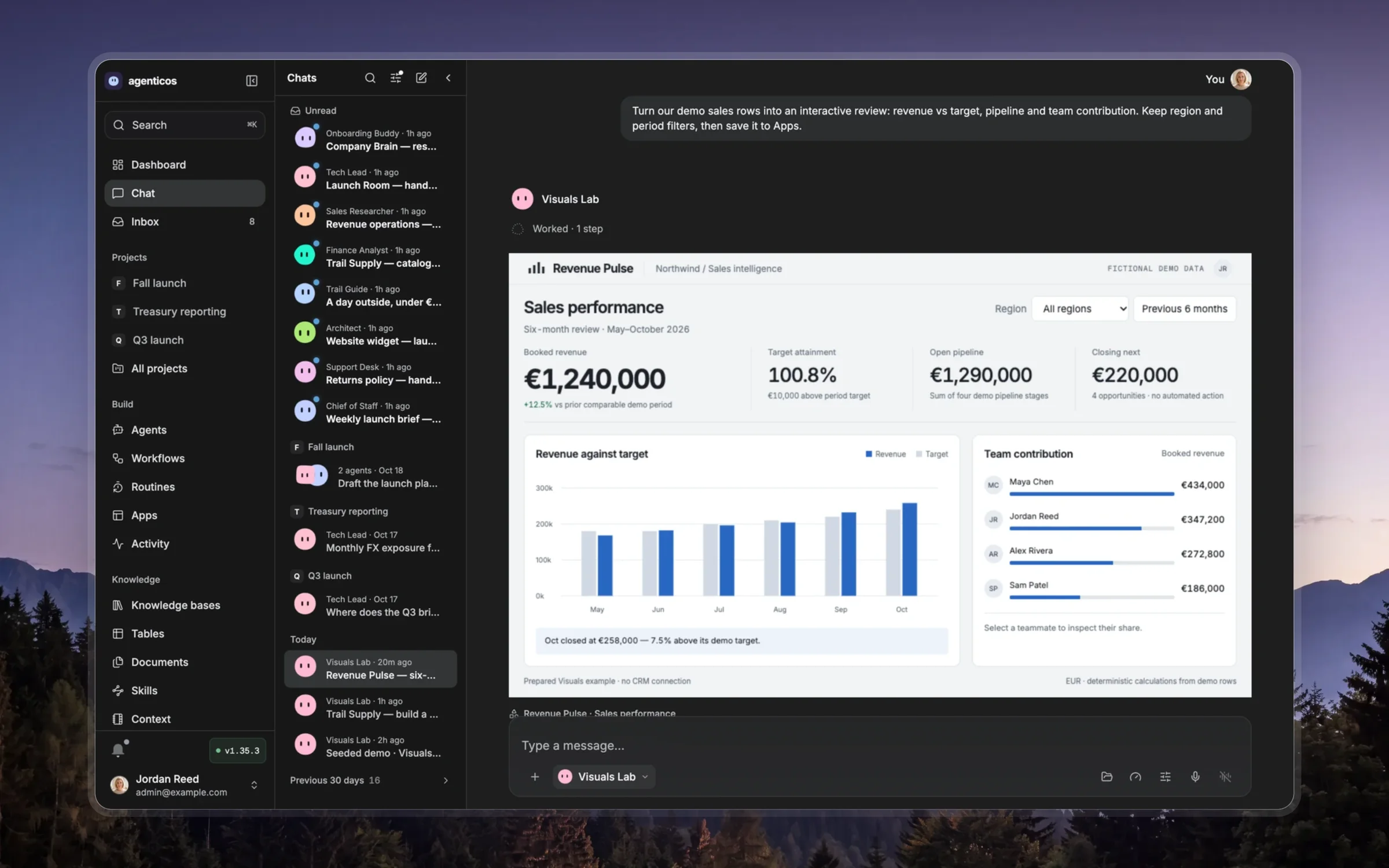
Choose the medium for the person's question: prose for a direct answer, a table for exact comparisons, a chart for a quantitative pattern, and an interactive visual when changing a control teaches something. A reusable App or deck needs an audience and purpose beyond this chat.
Lead with the conclusion or the decision. Build a visible hierarchy, use restrained color, readable type and consistent spacing, and fit both phone and desktop. Label units, source evidence and uncertainty. Keep controls relevant and make their consequences visible. Prefer one clear idea per view or slide over a dense dashboard.
Use the active tool description as the authority for input format, supported libraries, runtime limitations and publication. Do not infer another environment or copy unsupported API parameters from an example. Reuse the available templates when they fit, adapting content and composition to the task.
The optional resource references/design-recipes.md contains detailed design examples and template guidance; read the section needed for the chosen medium rather than loading every recipe. Current tool contracts win over older implementation examples.
For a presentation, write the narrative and evidence before styling slides. Each slide carries one claim with a clear takeaway; move supporting detail to notes or an appendix. Use consistent grids and type, realistic pacing and legible charts. Verify slide dimensions and the requested deliverable: a browser deck, PDF and editable PowerPoint are different outputs.
Render and inspect the result. Check readability, overflow, contrast, interactions, sources and the intended audience's access. Repair concrete defects before presenting it. Link the real artifact and describe what the person can try; do not call an unrendered draft verified.